


A rail network explained on screen and on the show floor.
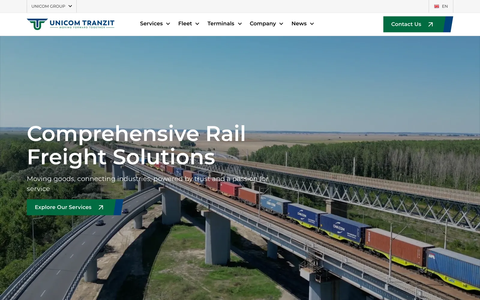
We built Unicom Tranzit a Webflow site in English, Romanian and Ukrainian, then carried the same route language onto two exhibition stand walls. Buyers meet one clear picture of the network wherever they find the company.
- Client
- Unicom Tranzit
- Sector
- Rail freight
- What we did
- Webflow website, Multilingual build, Exhibition stand design, Visual system
- Built to drive
- Stronger business connections.
- Live site
- unicom-tranzit.ro
The problem
A complex service that buyers struggled to picture.
Unicom Tranzit runs locomotives, wagons, terminals and border crossings for clients in more than one country. Explaining that to a logistics buyer takes maps, numbers and three languages. At a trade fair the company had seconds to make the same point to people walking past.
- Many services, terminals and gauges to explain at once.
- Buyers reading in English, Romanian and Ukrainian.
- A stand that had to read from across an exhibition hall.
The solution
Use the map the company already draws.
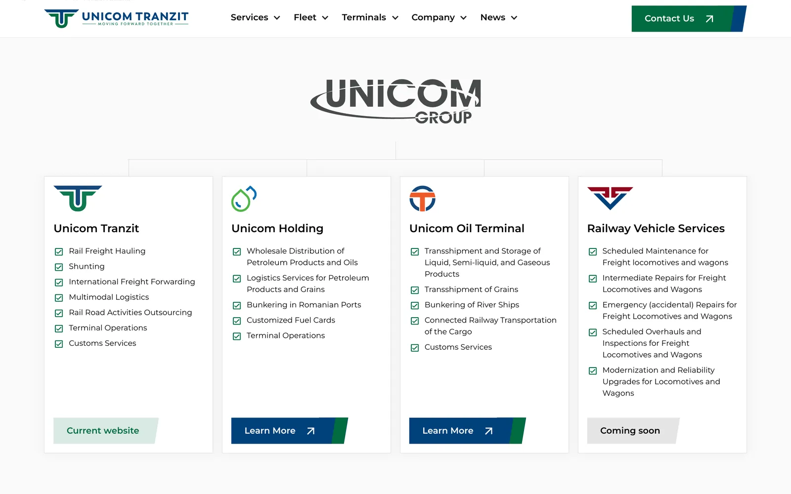
Unicom already explains its routes with schematics, circular operator badges and an interoperability chart. We built the website and the stand from that language, so the network looks the same in a browser, in a brochure and on a 4 metre wall.
Our intervention
What we took on.
Two pieces of work, one visual system behind both.
- 01
Webflow website
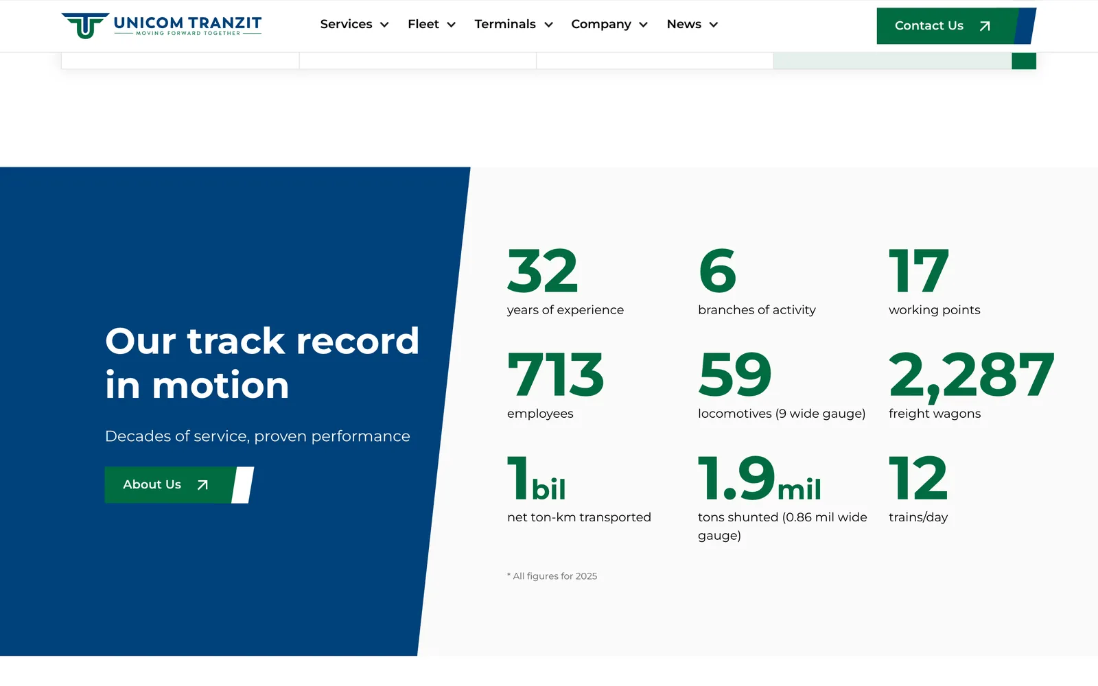
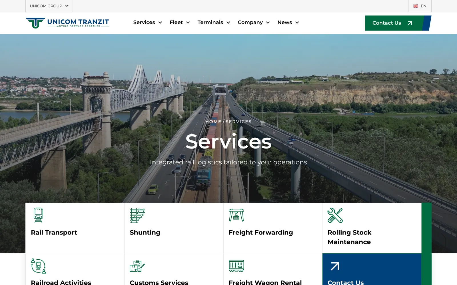
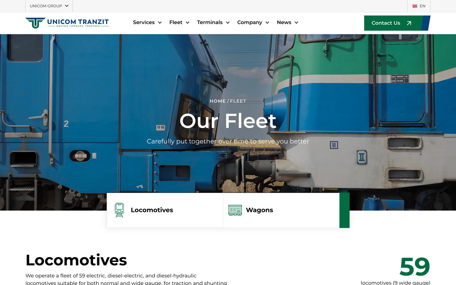
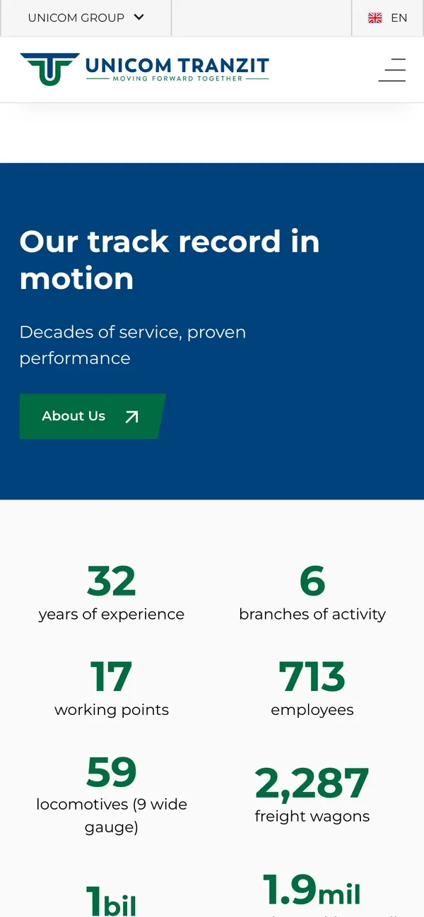
Pages for services, fleet, terminals and the Unicom group, with track record figures, a brochure download and a contact route on every page.
- 02
Three languages
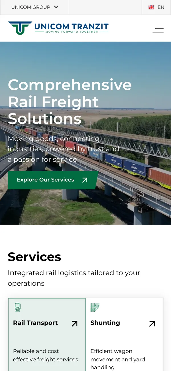
English, Romanian and Ukrainian versions built with Webflow localisation and hreflang, so each market lands on its own language.
- 03
Terminal pages
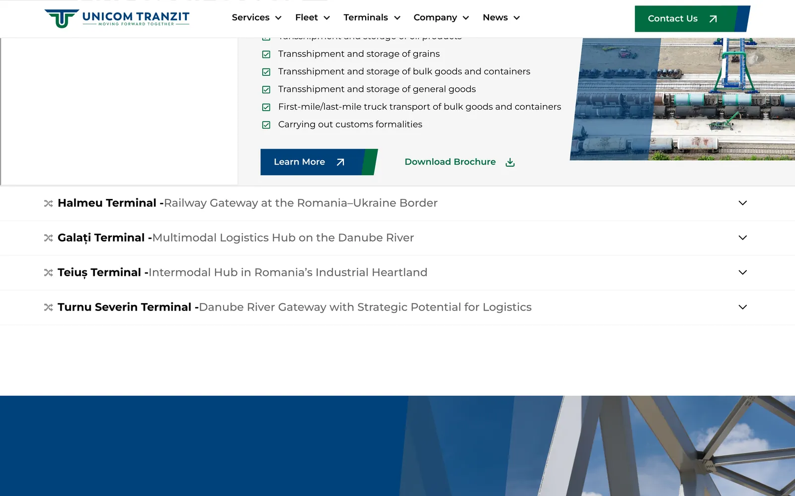
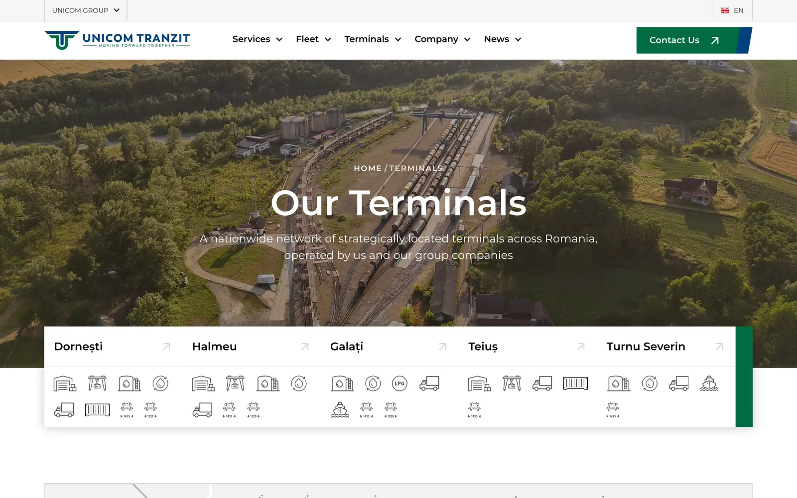
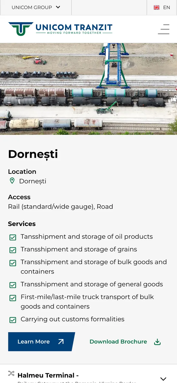
Each of the five terminals gets its location, access by rail and road, and the services it handles, set out the same way.
- 04
Exhibition stand walls
Two 4 by 3 metre walls drawn as route schematics, with 45 degree lines, node dots and badges in each operator's colour.
The Stega fix
Borrow the client's language, then sharpen it.
An expo stand and a website usually come from two agencies and look like it. We gave both the same source.
Their schematic, not a stock layout
Of three directions, the corridor layout won and we rebuilt it around Unicom's own route drawings instead of a generic expo style.
Vector only
The supplied aerial footage carried a third-party watermark, so the walls use no photography and print sharply at full size.
Drawn at real scale
Wall files were built at one pixel per millimetre, so every measurement on screen matches the printed wall.
Stega initiatives
What we keep improving.
The stand and the site share a system, so new pieces build on what exists.
Remaining stand panels
We are building the info desk and the smaller stand panels from the same badges and route lines as the main walls.
Network section
Next we are proposing to bring the schematic map from the stand into the website's network section.
Content in three languages
Next we are preparing a routine so news and new services go out in English, Romanian and Ukrainian on the same day.
Toolstack
The tools behind it.
- WebflowThe website, its CMS and the three language versions.
- Finsweet AttributesCounting figures and CMS helpers inside Webflow.
- GSAPScroll and entrance motion on the website sections.
- FigmaWebsite screens and the stand walls at one pixel per millimetre.
- Adobe IllustratorPrint-ready production files for the stand walls.